Quick wins that lifted bettybox subscriptions by 14%
betty had a website that wasn't performing commercially. Starting from analytics, I found quick wins: update the brand look, introduce the brand proposition around the editorial content, and make the subscription box and its call to action clear.
+14%customers subscribing to bettybox
Role
Design lead
Scope
Website redesign, navigation, product navigation
Role & ownership
What I owned
I analysed the GA data, set the design priorities against business goals, and designed the new navigation and UI.
Problem & constraints
What we were up against
Users
Confusing, inconsistent UI
Products hard to reach from editorial content
Business
Website not performing commercially
Constraints
Balance content discovery with selling the box
Process
01Redesign from analytics
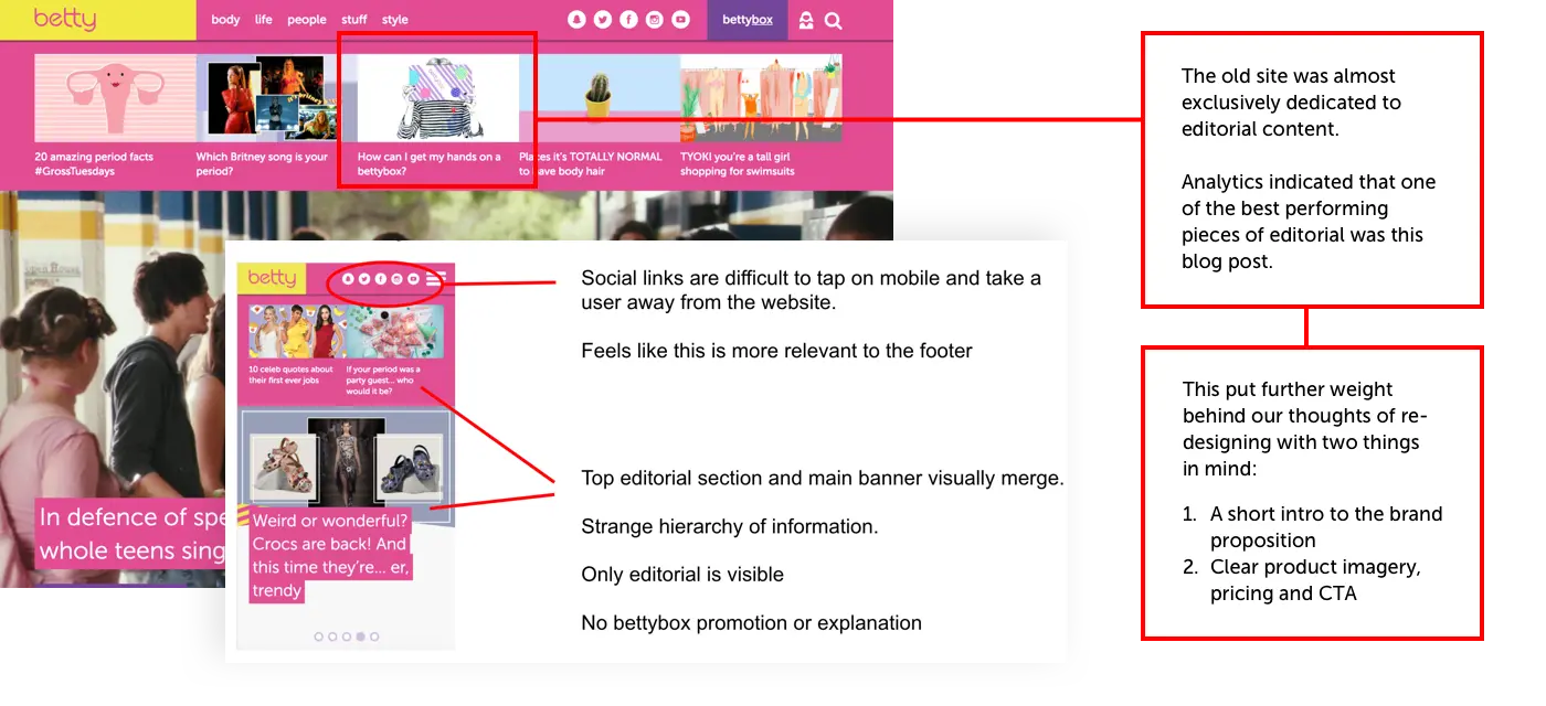
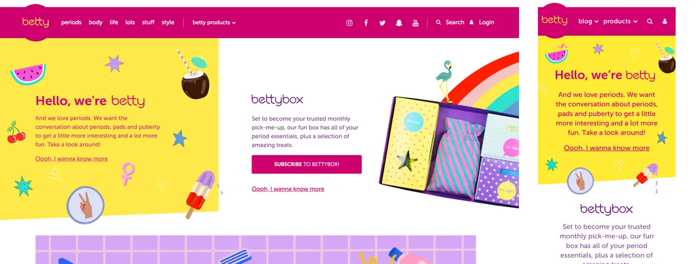
Three objectives: update the look, frame the editorial with the brand proposition, and show clear commercial messaging and a CTA for the box.
Before
Old designbetty/betty-01.webp
Old design
After
New designbetty/betty-02.webp
New design
02Brand continuity
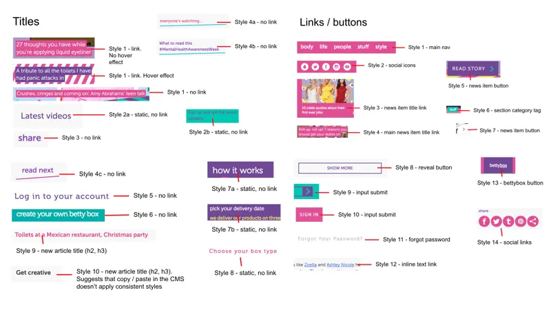
I consolidated a UI with little visual consistency.
Consolidated UIbetty/betty-04.webp
Consolidated UI
03Navigation and product flyout
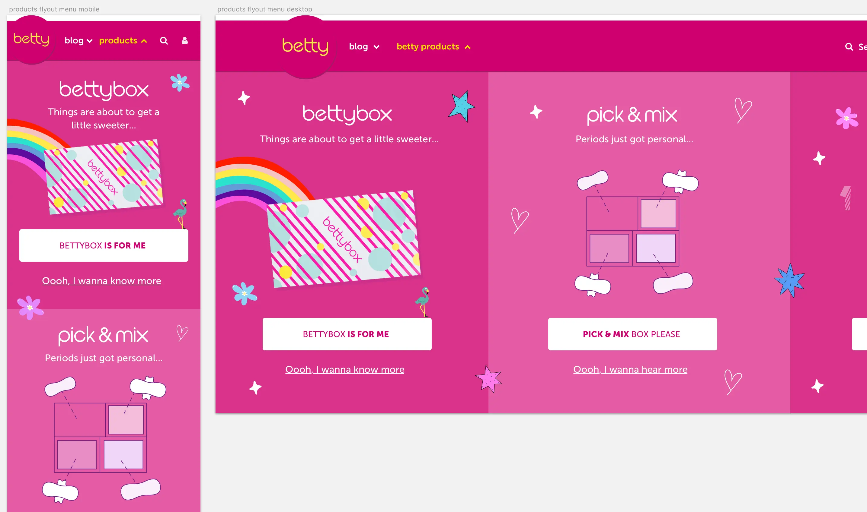
A new nav framed the updated logo in a pink badge. A flyout menu kept products reachable from anywhere without crowding the content.
Product flyout menubetty/betty-07.webp
Product flyout menu
Outcome
Impact
A 14% uplift in customers subscribing to bettybox.
Takeaways
What I'd take to the next project
Start with the dataThe fastest wins came from what analytics already showed.