An accessible website and design system for the UK's largest children's charity
As part of Barnardo's digital transformation, I led the redesign of the website and contributed to a design system the charity could use to build future products and services cost-effectively. The new donation journey raised online donations by 8%.
- Role
- Design lead (consultant); part of the transformation leadership team
- Team
- Managed a team of in-house designers
- Scope
- Website, donations, design system, training
- Worked with
- Cross-functional digital leadership, CMS editors, service users
What I owned
I sat on the leadership team for the digital transformation, partnering with cross-functional peers on strategy and managing the design team. I made accessibility and consistency priorities so the charity's products would be inclusive and last.
What we were up against
Users
- Slow loading
- People couldn't find information
- Friction in the donation journey
Business
- Online donations were too low
- Brand use was inconsistent
- Products were built in a fragmented way, which wasted money
Constraints
- A brand-new site from an external agency had to be repaired, not replaced
- Unvalidated patterns and no accessibility testing
- Charity budgets
01Inheriting a flawed build
The agency-built site ignored best practice in favour of unvalidated patterns, such as a combined menu and search button floating over CMS imagery that opened a modal. Accessibility hadn't been tested, and colour and design language were inconsistent.
barnardos/barnardos-01.jpg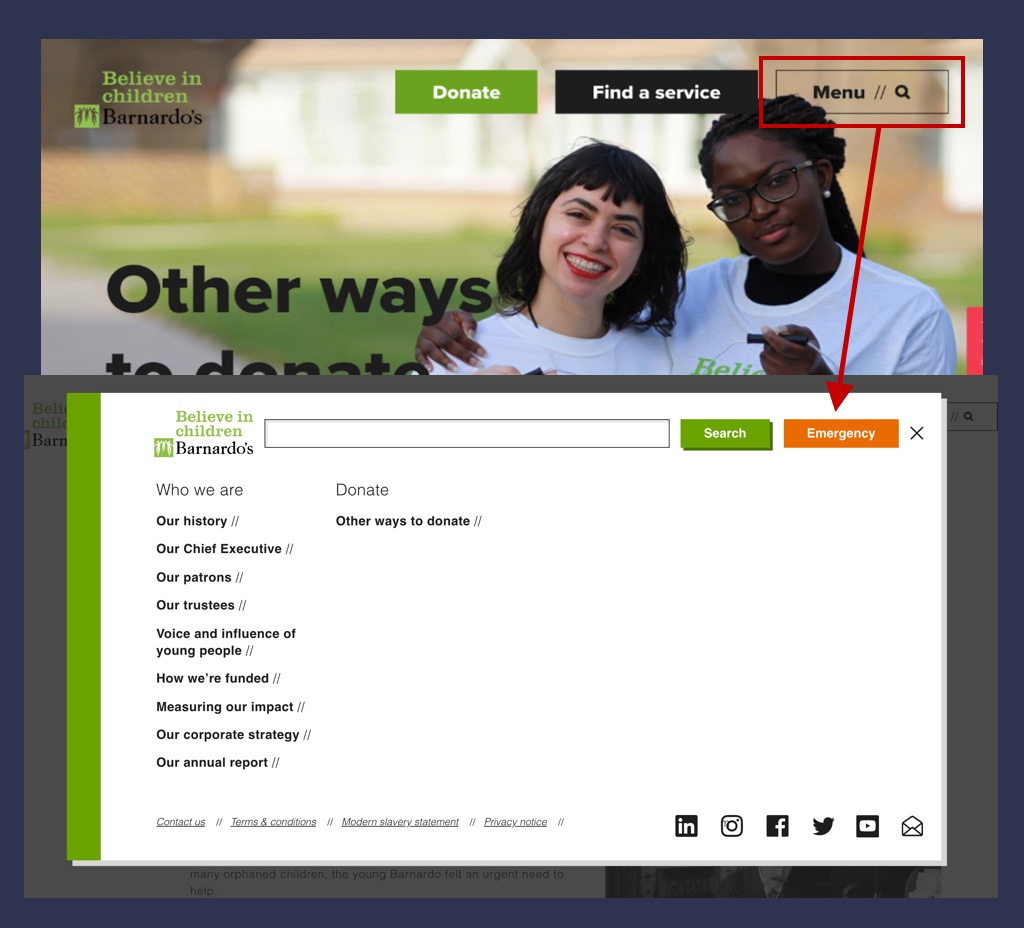
02Replacing the grid
An invented 10-column grid meant many breakpoints and a lot of front-end complexity. With over 70% of visitors on small screens, I moved to a simple mobile-first layout. Left-aligning components cut code complexity and improved readability.
barnardos/barnardos-02.jpg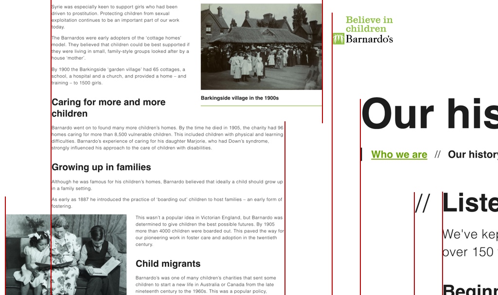
barnardos/barnardos-03.jpg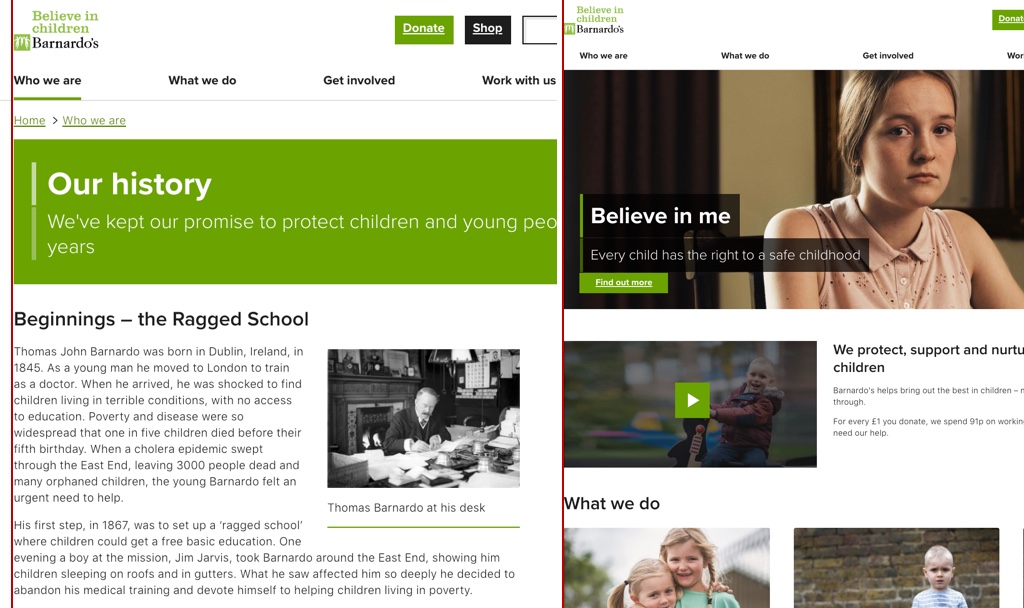
03A consistent design language
I trained the in-house designers to use the new design system, so every product built in-house used the same building blocks and the basic patterns came ready-made.
barnardos/barnardos-04.jpg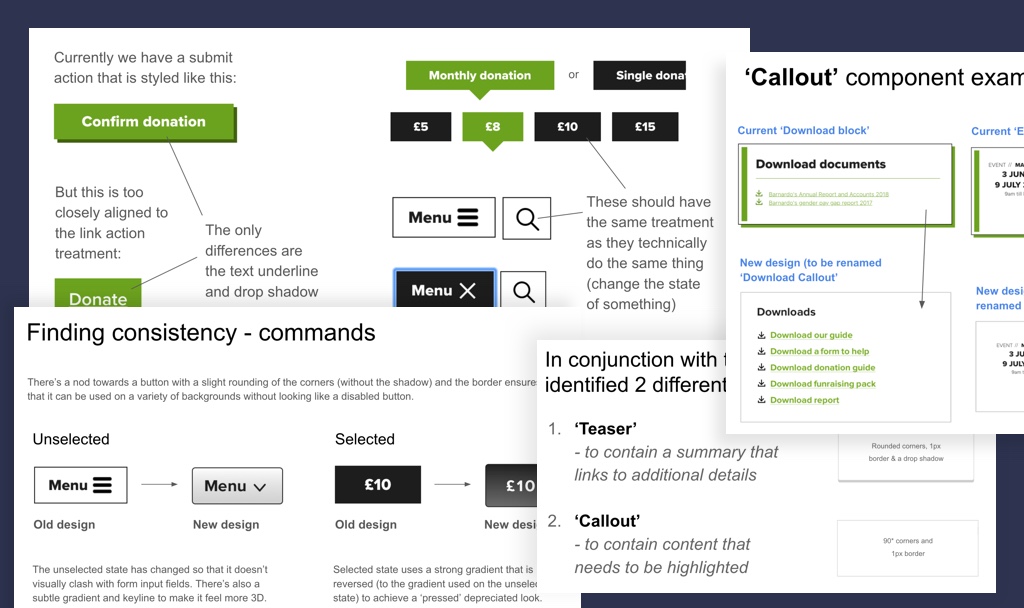
04Testing new services on the system
With the basics handled, the team could focus on bespoke problems. For a 'leaving care' chat app with Plymouth City Council, we prototyped quickly from the system and tested ideas with real service users.
barnardos/barnardos-05.jpg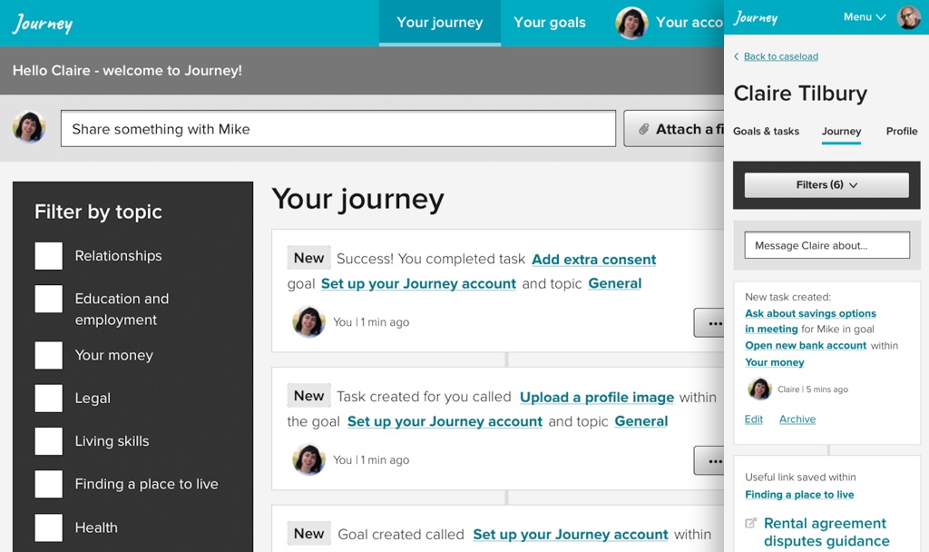
05Teaching the 'why'
As a consultant, I needed to leave work the permanent team believed in. I ran presentations for large audiences, one-to-ones and group sessions, and documented each decision with the user feedback behind it, from CMS editors and site visitors alike.
barnardos/barnardos-06.jpg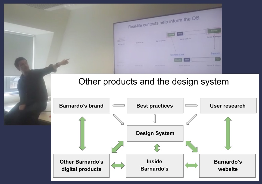
Impact
A WCAG AA, brand-consistent, faster website; online donations up 8%; and a design system the charity continues to build on.
What I'd take to the next project
- A system only sticks if people understand itTraining and documented reasoning mattered as much as the components.
- Simpler grids are cheaper gridsRemoving the bespoke grid made the site easier to read and to build.