Making My Account the place customers manage their cover, and add to it
Domestic & General protects household appliances for millions of UK customers. As Lead Product Designer on the My Account squad, I worked on two jobs the business needed the account to do: let customers sort things out themselves, and give them an easy, well-timed way to protect more of their appliances.
- Role
- Lead Product Designer
- Team
- My Account squad: product, engineering, content design, data science
- Timeline
- 2023–2024
- Design system
- Eevee, D&G's in-house system
- Research
- Card sorting, moderated prototype testing, session replays, A/B tests
What I owned
I led design for My Account within a cross-functional squad. I planned and ran the research, designed journeys from wireframes to high fidelity in the Eevee design system, and worked with product, engineering, content design and data science on what to build next.
- Ran card sorting and moderated prototype testing, and turned the findings into design recommendations
- Designed the dashboard, guarantee and plan pages, the account creation journey and the quick quote
- Redesigned core form components and keyboard behaviour to meet accessibility standards
- Set up fluid type, spacing, colour and grid foundations shared by designers and developers
- Brought Financial Promotions and Compliance in early on anything that changed how cover is sold
What we were up against
Users
- Customers couldn't see what their plan covered; there was only a link to download the documents
- There was no way to cancel a plan online
- Manual account creation was confusing, and session replays showed people stuck on the address step
- Two cross-sell banners got in the way of people who only wanted to see their plan
Business
- Get more customers self-serving through digital channels
- Grow digital sales conversion and registration visits
- Make My Account a channel for taking out more cover at the right time
- Bring free manufacturer guarantees, starting with Beko, into My Account alongside paid plans
Constraints
- A regulated product: changes to how cover is sold needed Financial Promotions and Compliance sign-off
- Appliances must be in good working order and out of guarantee to qualify for cover
- Everything built in Eevee, the company design system
- Account security and lockout rules
01Bringing guarantees into My Account
Until then, only customers who had bought a protection plan could create an account. The business was about to let Beko customers register their free guarantees online too, so I needed to know what people expect to see once an appliance is registered.
I ran two separate card sorts with 25 participants: one for a free guarantee and one for a paid plan. Paying changes what people expect, and asking them to think about both at once would have been too much. Participants ranked the information they considered important and set aside what wasn't.
02Designing the dashboard from the findings
Everyone wanted to know what was covered, and it usually ranked first, yet we only offered a document download. Plan holders wanted to book a repair straight away rather than look for "expert help". Guarantee holders cared more about reaching the manufacturer. And 71% didn't want prompts to add other appliances on the page about the one they'd just registered.
Those findings set the hierarchy for the dashboard, guarantee and plan pages: plans, guarantees, and cancelled or expired cover grouped separately, repair booking up front for plan holders, and a single cross-sell placed where it wouldn't get in the way. I designed loading skeletons and empty states too, so the dashboard holds its shape while plans load or when a customer has none. Cancelling online went onto the roadmap.
dg/dashboard-desktop.webp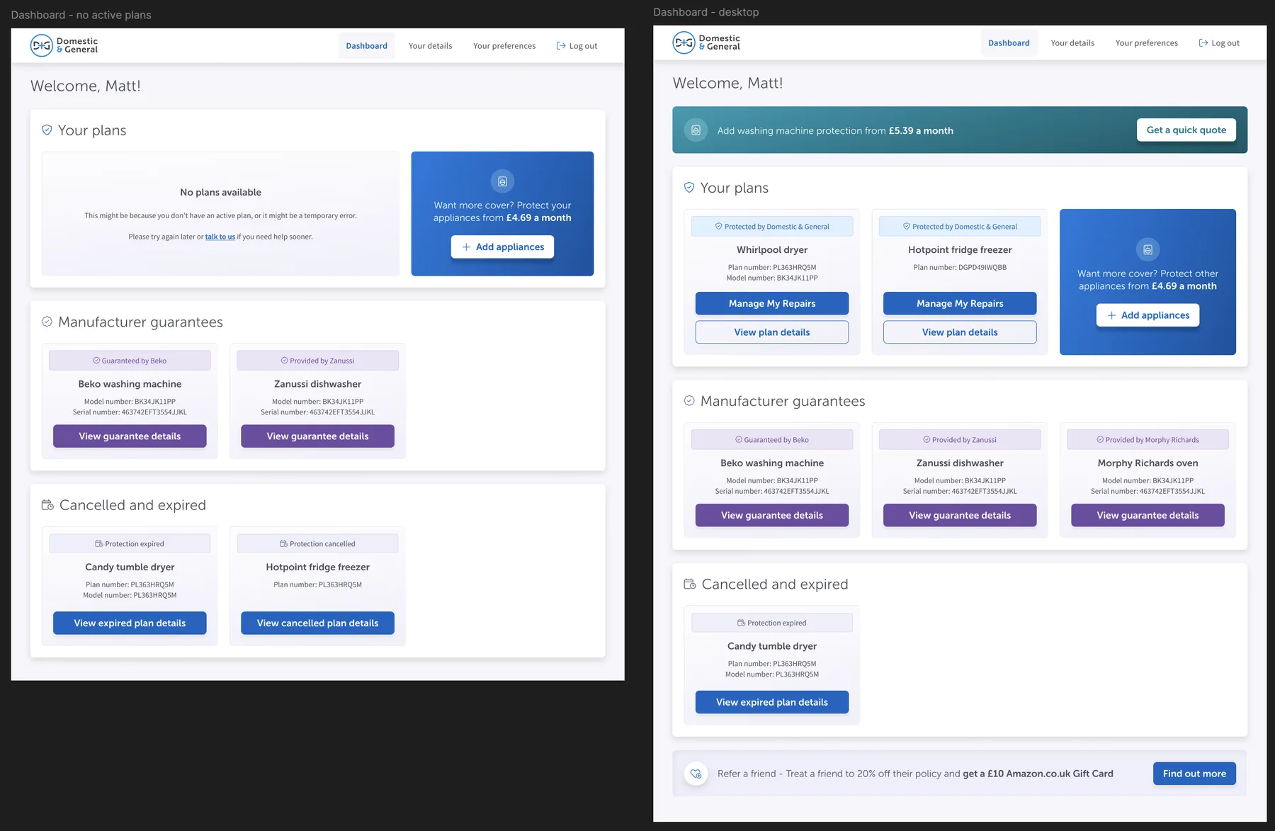
dg/beko-registration-flow.jpg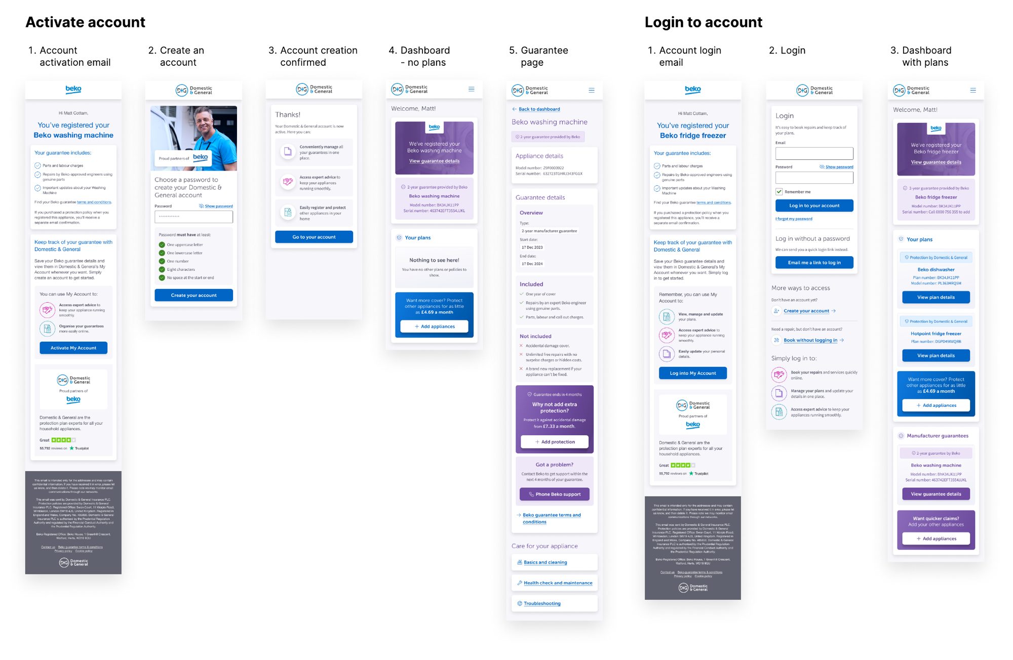
03Account creation, one question at a time
Customers who signed up manually were getting stuck. Session replays in Quantum Metric showed people struggling to get past personal details, especially the address field: the lookup was slow, and its results opened in a small scrolling box over the page, which is hard to use on a phone.
I redesigned the journey as a stepper with one question per screen, introductory screens explaining where to find plan details, and helper text written with our content designer. I rebuilt the address component with clear states for searching, choosing and entering an address by hand, and the password component so its rules read as a checklist that turns green or red as you type.
In testing against the existing journey, participants preferred the step-by-step format and understood the new address and password components. Testing also showed quick fixes for the live journey: drop the word "Login" from a sign-up flow, and use labels like "First name shown on plan".
dg/address-pain.webp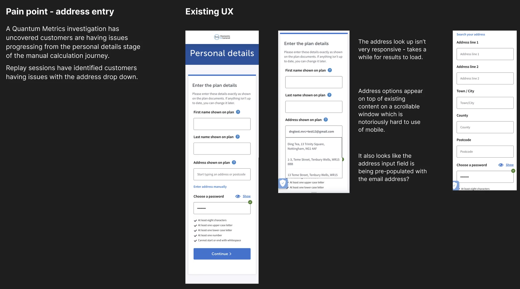
dg/address-component.webp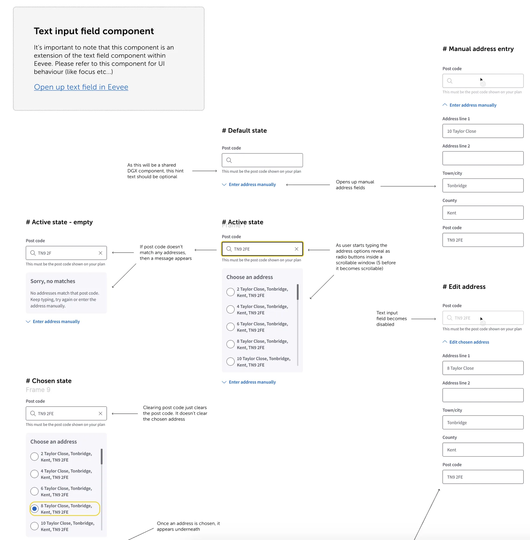
dg/password-before.webp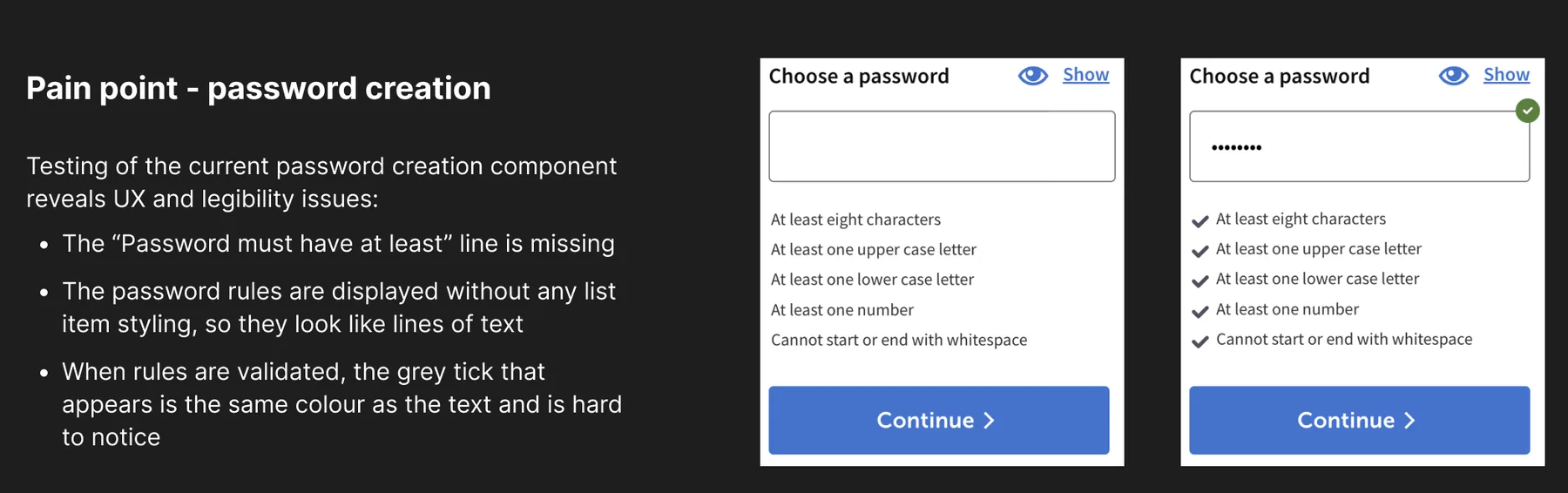
dg/password-after.webp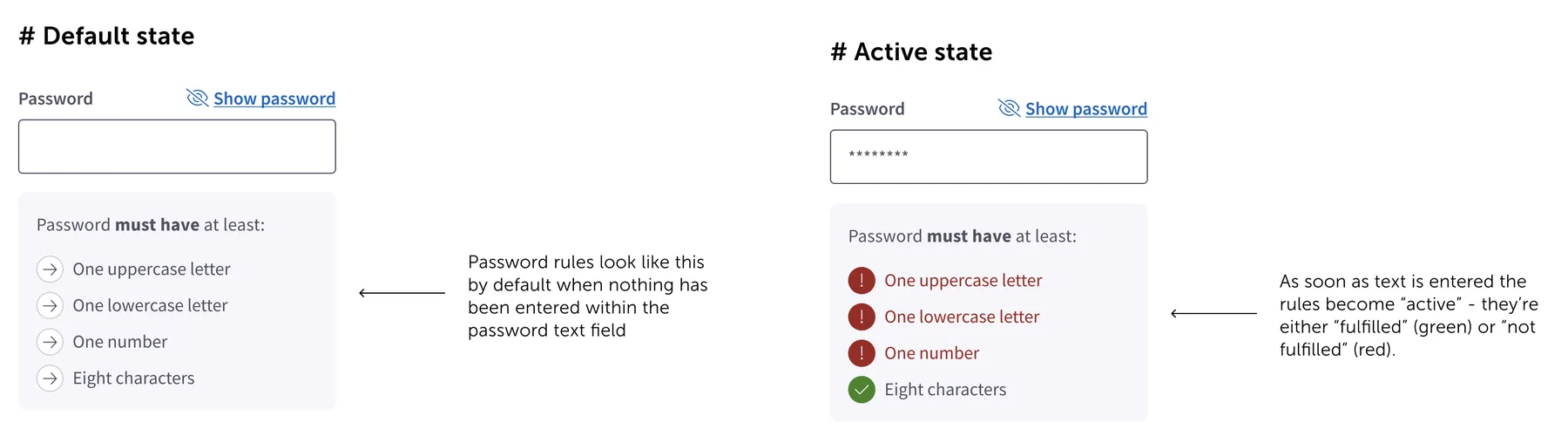
04A quick quote inside the account
We wanted existing customers to be able to protect another appliance without leaving their account. I tested an embedded quick-quote prototype against the existing quote and buy journey. People found the small widget cramped on mobile and disliked being asked "Do you have a dishwasher?" out of nowhere, so the design moved to full screens with a clear step count.
Data shaped each step. The ten most popular brands made up around 60% of choices, so they're offered first with search for the rest. Around 40% of customers reported guarantees longer than two years, so the guarantee question explains how to check rather than assuming. And about 30% of people who first said their appliance wasn't working went back and changed their answer, so the "good working order" step spells out exactly what that means.
The sessions also exposed problems in the live journey: the "No thanks, show me the quote" link sat below the fold, and the basket appeared under the pay button. We prioritised both fixes.
dg/quick-quote-flow.webp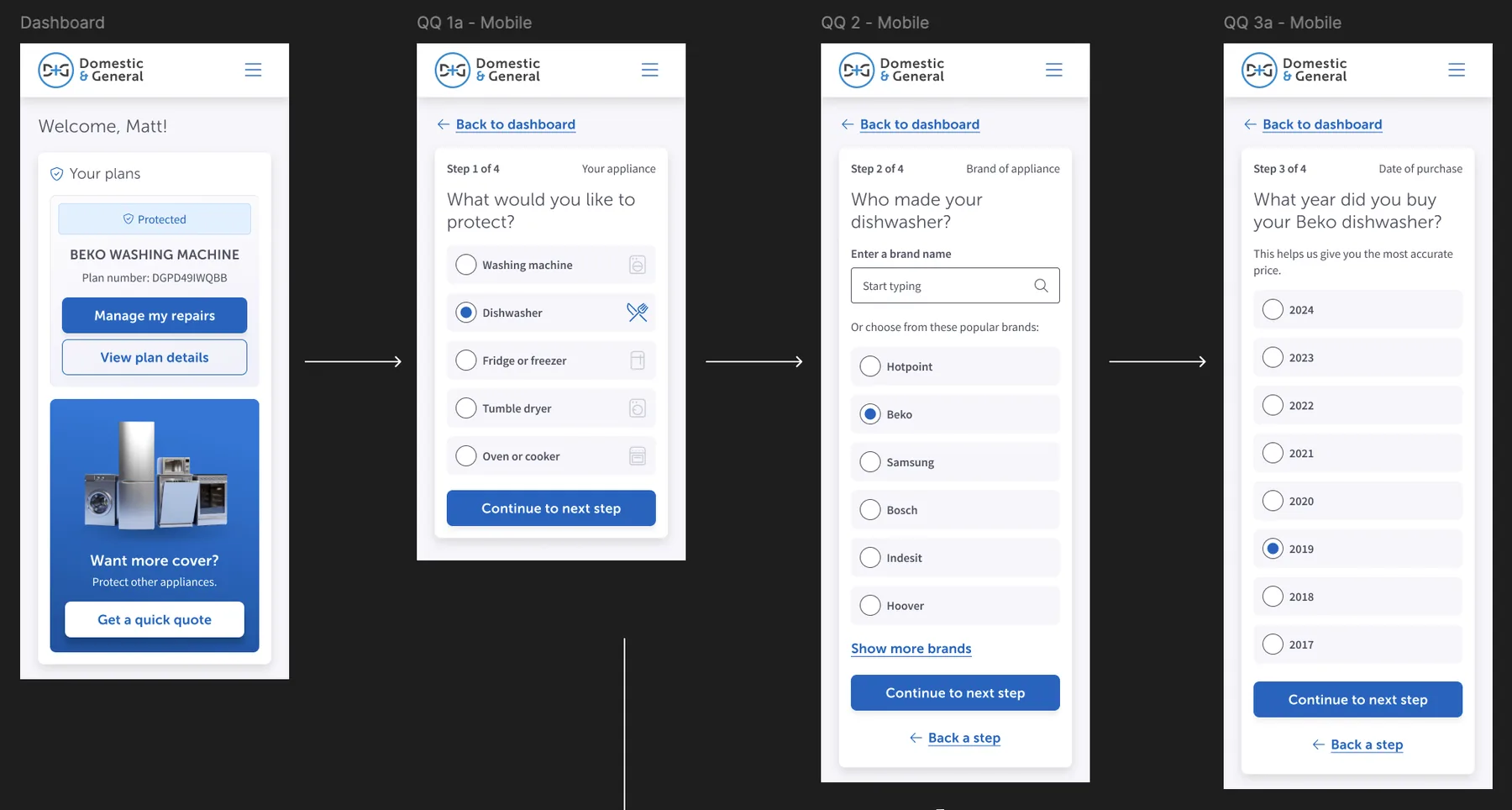
dg/quick-quote-guarantee.webp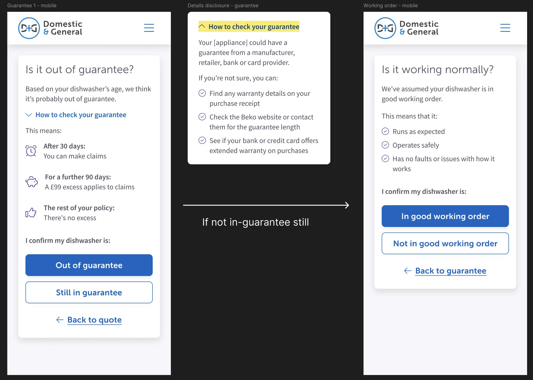
05Making it work for keyboard users
The appliance picker looked like a set of buttons but behaved like radio buttons, and there was no visible focus. Keyboard users tabbed in, pressed Enter and nothing happened. I redesigned it to look and behave like the radio group it is, with a clear focus indicator, visible checked states and a submit button. I also ran contrast tests on our button and background colours so every pairing we used met WCAG AA.
dg/contrast-experiments.webp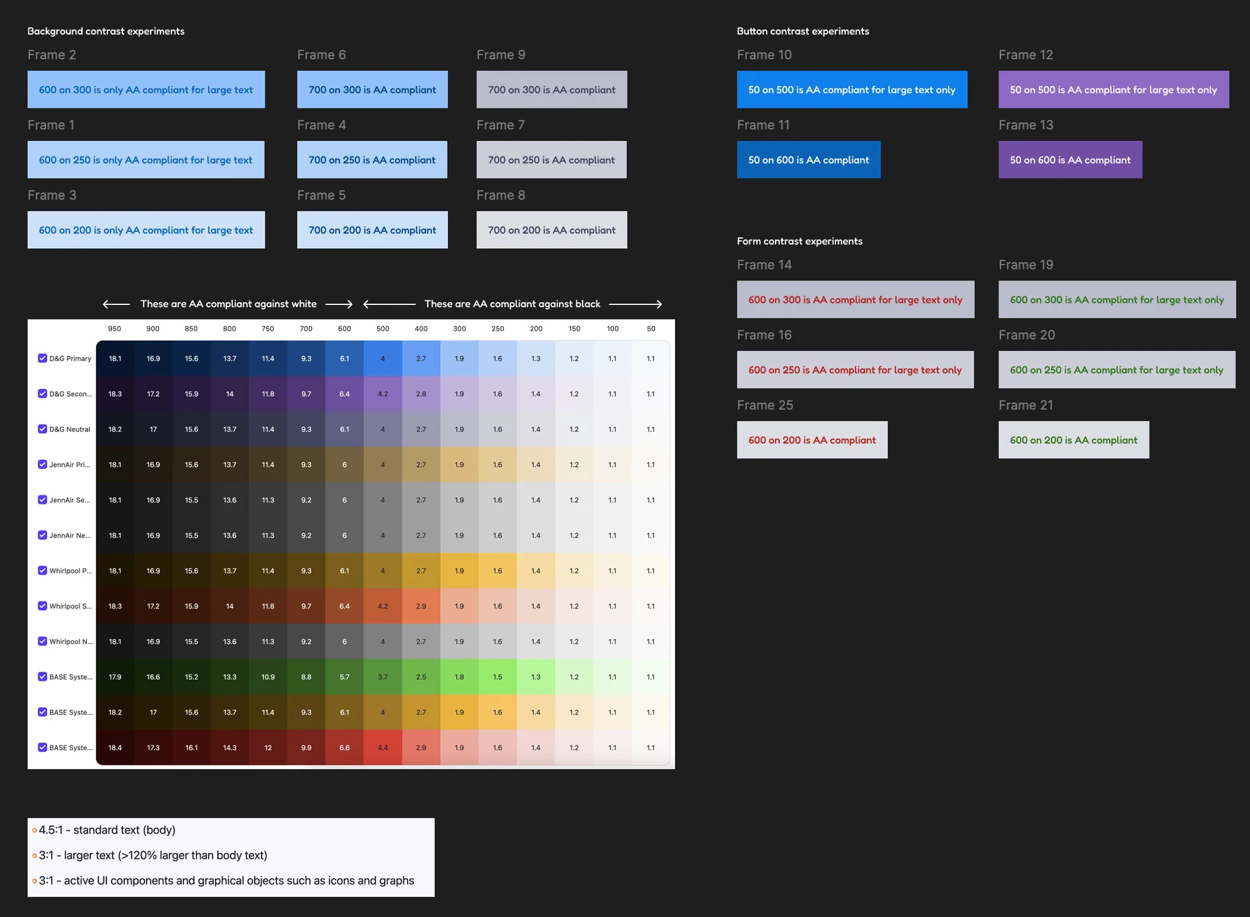
dg/keyboard-current.webp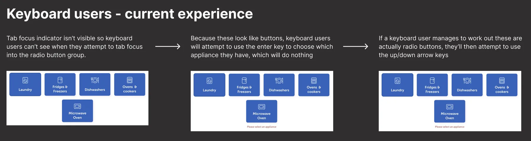
dg/keyboard-redesign.webp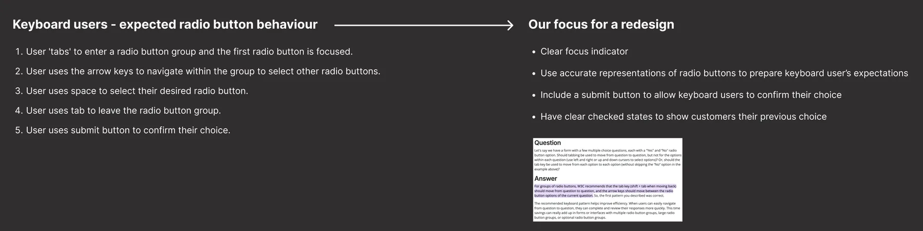
06Foundations: fluid type, colour and grids
Our type and spacing jumped at each breakpoint, so a heading could look right on one screen and oversized just below the next. I moved us to fluid type and spacing that scale smoothly between a 360px and 1536px viewport, defined once and shared by design and code.
For colour, I built the brand palette on the OKLCH colour space. Its lightness value gives a numbered scale, like dg-primary-60, where every colour at the same number has the same perceived lightness. Designers and developers can predict contrast from the name alone. Three Figma frame sizes and a 12-column grid at every breakpoint completed the set.
dg/colour-oklch.webp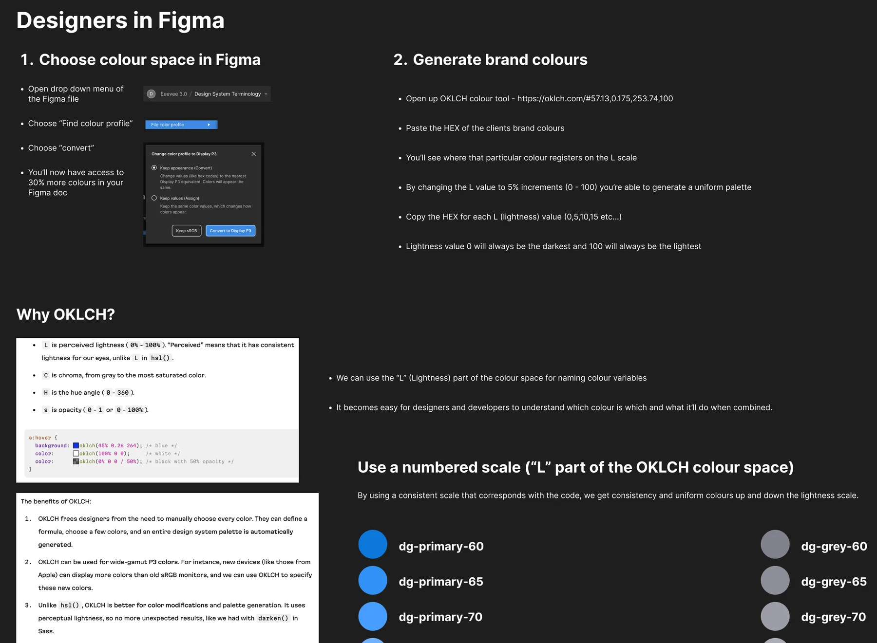
dg/grid-breakpoints.webp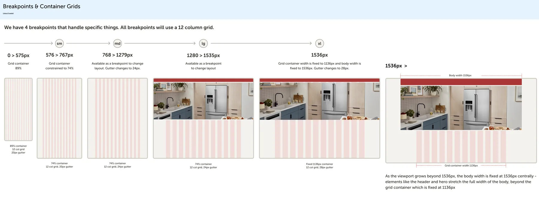
dg/type-breakpoints.webp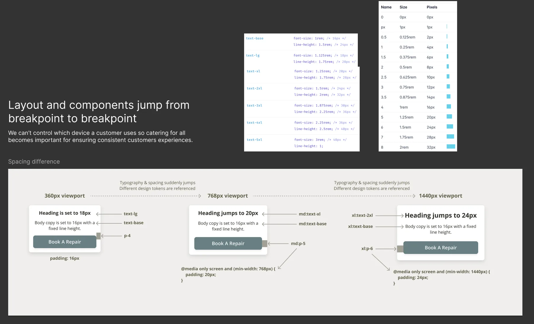
dg/type-fluid.webp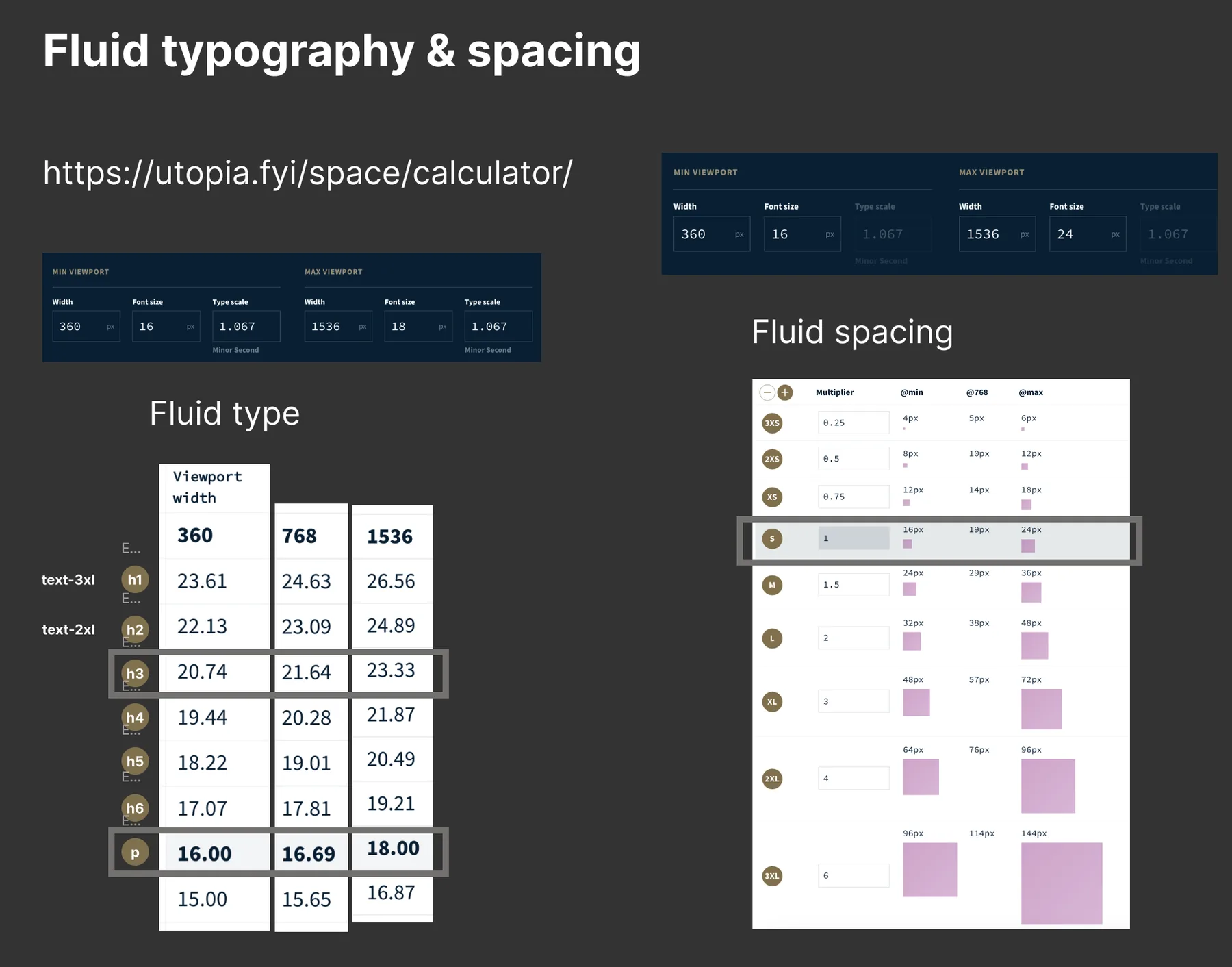
Impact
My Account became a working sales and service channel as well as a place to check a plan. In the year to date, dashboard cross-sell was seen over 3 million times, 6% of views clicked through to get a quote, and My Account sent around 175,000 visits to Quote & Buy. The multi-item basket added roughly 29,000 extra plans from about 24,000 transactions. Beko guarantee customers could register and manage their appliances in the same place as their paid plans.
These were squad results. Design's part was making sure each change was grounded in what customers told us, and that it worked for everyone.
What I'd take to the next project
- Free and paid cover need different pagesPaying changes what people expect: plan holders want to book a repair, guarantee holders want the manufacturer.
- Don't test old and new on the same personWhichever version participants saw second, they preferred. Next time each person sees one journey.
- Let behaviour data write the questionsBrand popularity and how people answered guarantee questions shaped the quote steps more than opinions did.
- Upsell has to earn its placePeople log in to see their plan. One relevant offer worked better than two competing ones.