Doubling conversion for the UK's preloved clothing platform
Thrift+ is a B Corp that takes bags of unwanted clothes, photographs and lists every item, and rewards sellers with points to spend, exchange with partners or donate to charity. I redesigned the whole Shopify platform, buying and selling, during a period of growth. Conversion more than doubled.
- Role
- Design lead
- Scope
- Buyer and seller experience, customer accounts, visual language
- Platform
- Shopify, mobile-first
- Worked with
- Thrift+ product, marketing and warehouse teams; developers
- Live
- thrift.plus ↗
What I owned
I owned the redesign from audit to handover: analytics and UX audit, research synthesis, journeys and prototypes, test scripts, the digital visual language, and component documentation for the developers.
What we were up against
Users
- The site was painfully slow on older phones, and those shoppers were far less likely to buy or sell
- Clear UX issues in the mobile purchase journey
- Existing customers weren't engaged enough to sell through their account
Business
- Customers were dropping out of the conversion funnel
- Not enough new sellers signing up
- A rebrand needed bringing online
Constraints
- Shopify platform
- Every garment is a one-off, so stock behaves unlike normal ecommerce
- Over 80% of existing customers were women
01Understanding the problem
I started with an audit of the existing site. Metrics showed problems in the mobile conversion journey and Lighthouse showed a very slow load. I shipped UX fixes to the existing site first and monitored them; the results made the case for a full redesign. A content audit and sitemap tracked key content through the project.
thrift/thrift-02.jpg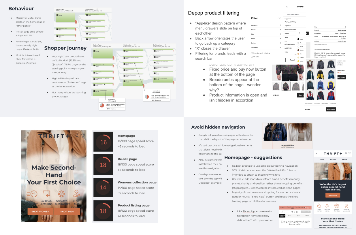
02Research: competitors and patterns
I audited competitors and borrowed proven patterns from established ecommerce platforms like ASOS rather than inventing new ones. With the Thrift+ team I built personas from their survey data: bargain hunters, environmentally motivated shoppers, time-poor people who valued the clear-out service, and people who liked donating to charity. The personas lived in the Figma file as a constant reference.
03Prototyping journeys in low fidelity
- Journeys for each persona, focused on a happy path to conversion
- A taxonomy map of the product data the warehouse captures, which became the basis for filtering
- Greyscale, mobile-only prototypes so testing stayed on function
- Content split by gender with women as the default, based on customer data. This also removed the clutter of male/female buttons competitors had on every component.
thrift/thrift-03.jpg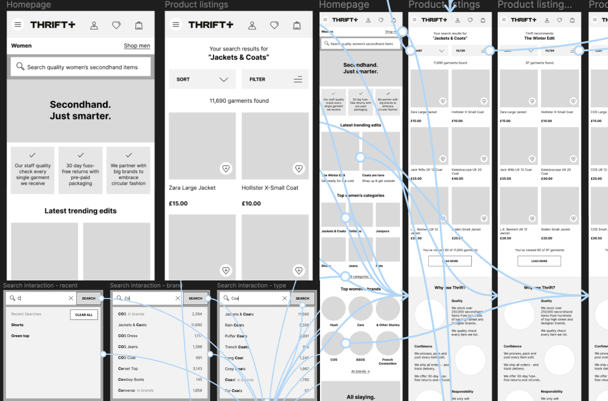
04Testing and iterating
Participants could buy easily from the first round. Some couldn't find the gender switch, so I moved it out of the menu into a toggle at the top of the homepage. Browsing behaviour came through in later rounds. Because each item is unique, I replaced "favourites" with watching an item, eBay-style, which opened up price alerts and back-in-stock notifications.
thrift/thrift-04.jpg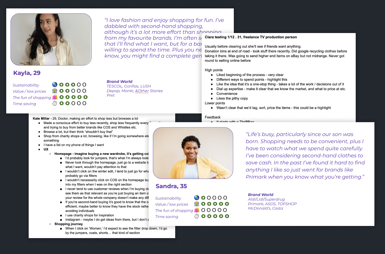
05Designing the seller experience
Reselling is what sets Thrift+ apart. I designed a seller flow that takes the hassle out of clearing a wardrobe: review photos, prices and details for every item, then spend the points earned on preloved items, partner rewards like ASOS, or a charity donation.
thrift/thrift-06.jpg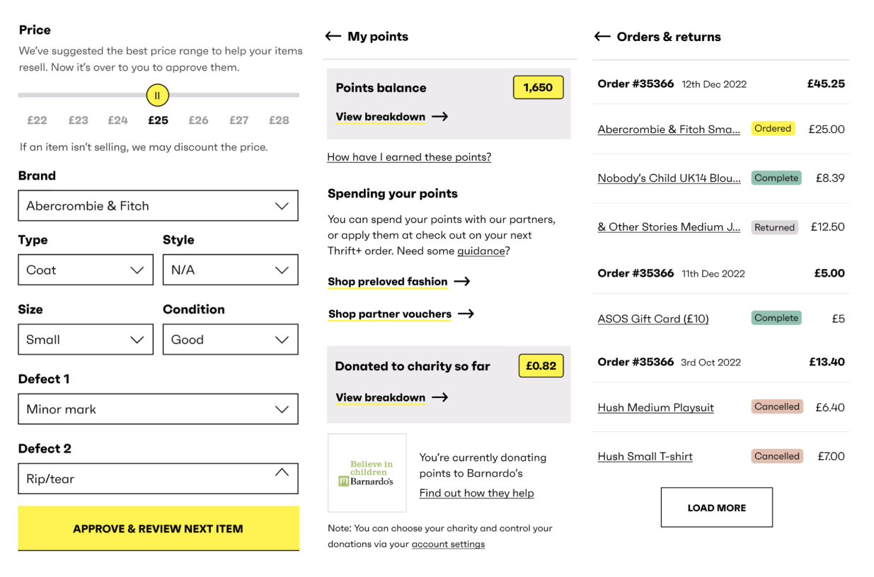
06A digital visual language
I translated the branding agency's offline creative into a digital design language, recommended changes that marketing adopted on and offline, and documented component states and behaviour in Figma for development.
thrift/thrift-05.jpg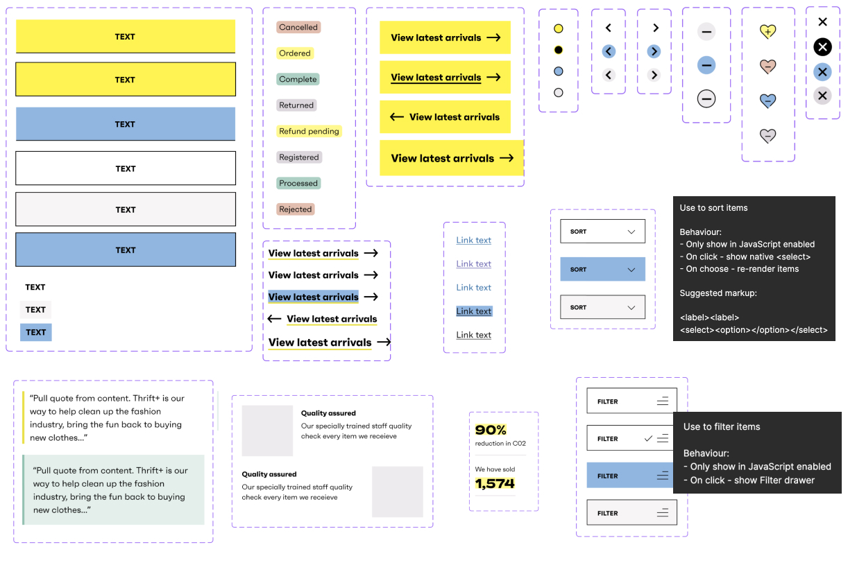
Impact
The redesigned platform more than doubled the website conversion rate and lifted total sales by 3%.
thrift/thrift-07.jpg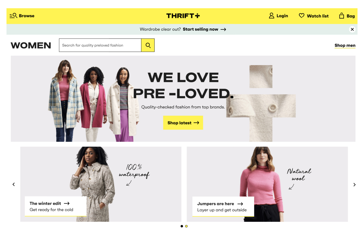
What I'd take to the next project
- Fix the old site firstShipping small UX fixes and measuring them gave the evidence for a full redesign.
- Unique stock changes the patternsWith one-of-a-kind items, 'watching' fit better than 'favourites' and created a reason to come back.
- Speed is part of the designShoppers on older phones were the ones we were losing.