Raising subscriptions for the UK's No. 1 period box
When I joined, the Pink Parcel website was off-brand, the subscription offer was hard to find and people weren't converting. I realigned the site with the brand, fixed accessibility in the palette, and rebuilt subscription and checkout for mobile.
- Role
- Design lead
- Scope
- Website, subscription flow, checkout, period-tracking app
- Worked with
- Marketing and commercial stakeholders
What I owned
I led design, set priorities from analytics with commercial stakeholders, and made the case for brand colour changes to meet accessibility needs.
What we were up against
Users
- Subscription information was hard to find
- The primary pink failed contrast with white
- Account creation was forced mid-flow
Business
- Heavy marketing spend wasn't converting
- Site didn't match offline brand
Constraints
- Brand colours already in market
- Mostly mobile traffic
01Aligning with the brand
First I brought the site in line with the offline brand: a cleaner look and a clear product offer.
pink/pink-02.png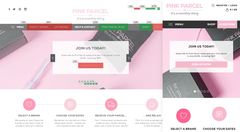
pink/pink-01.png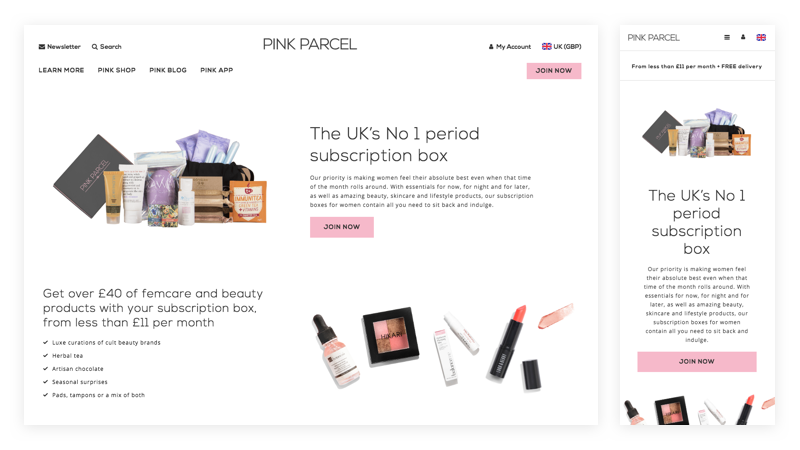
02Decisions from analytics
I used existing GA data to find opportunities and prioritised improvements where revenue could be attributed.
pink/pink-03.png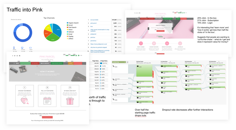
03Accessible colour
The primary pink wasn't accessible with white, so I led changes to the palette so CTAs could be read.
pink/pink-04.jpg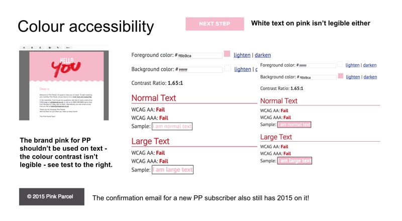
04Subscription and guest checkout
I redesigned the subscription flow mobile-first and removed the forced account creation midway through, asking for less up front so people could check out as guests.
pink/pink-05.jpg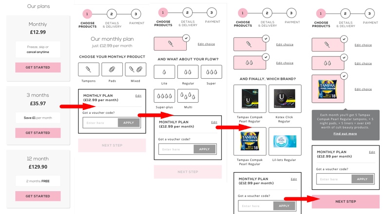
pink/pink-06.jpg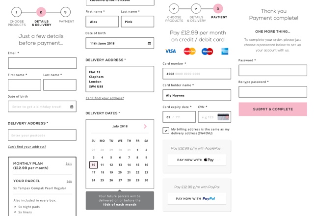
Impact
Customer subscriptions rose 16% and conversion rose 6%.
What I'd take to the next project
- Accessibility can mean changing the brandReadable buttons mattered more than the original pink.
- Every field costs completionsGuest checkout removed a step people kept abandoning.